Responsive Design and CSS3 Media Queries

Regular readers on this site will notice that there has been a major change on the site lately. The design of the site has changed as well as the layout. I have been playing around with the idea of Responsive design and also updating the look and feel of this site for a while. It was quite colourful before and was in need of some serious updating!
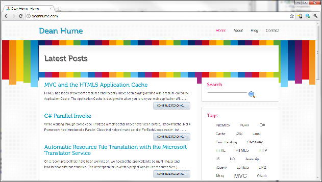
This is how it used to look before the update:
Responsive design
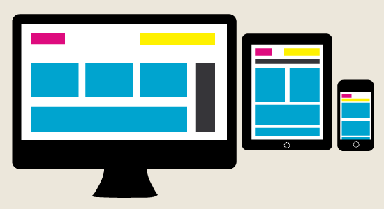
So, what is Responsive design? Well, it is the approach that suggests that design and development should respond to the user’s behaviour and environment based on screen size, platform and orientation. The term Responsive Web Design was coined by Ethan Marcotte and is the practice of using fluid grids, flexible images, and media queries to progressively enhance a web page for different viewing contexts. Imagine only having to code one front end and having it adapt no matter what the screen size or device that you are using. This is what responsive design aims to achieve. If you resize the browser on this page you will notice that the layout adapts accordingly - give it a try!
The advantage of using Responsive web design is that we only have to support one UI layer and we don't need to worry about the device that is accessing the page. Previously I would intercept the User-Agent of the user and if it matched a list of devices, I would redirect to a specially designed mobile page. Now, all I need to do is provide the correct layout according to the screen size.
For more information on Responsive design check out this article.There is also a great gallery for responsive design called Mediaqueri.es. Scott Hanselman also recently updated his blog to use CSS3 mediaqueries.
Using the CSS
Now, I'm no UI developer and I'm not really that good with CSS - so I needed a way to get this site developed quickly and easily. I have also been experimenting with responsive design and CSS3 media queries in order to get this site enhanced to be able to handle any screen size.
The advantage of using media queries is that you can display different CSS styles depending on the size of the browser window and viewport. You simply use it in your stylesheet like normal CSS.
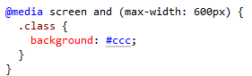
The following CSS will apply if the viewing area is smaller than 600px.
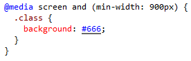
And the following CSS will apply if the viewing area is greater than 900px.
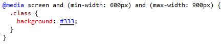
You can also combine multiple queries.

As I'm no expert with CSS and Responsive design, I needed a boilerplate that would make development quick and easy. After some searching on the net, I came across Skeleton. I can't emphasize enough how easy it is to use this boilerplate. Skeleton uses best practices and works alongside your styling. It is not a UI framework, it's a development kit that provides the most basic styles as a foundation, but is ready to adopt whatever your design or style is. Skeleton is based on a variation of the 960 grid system and getting up to speed with it takes no time at all.
If you were using Skeleton and the above snippet of HTML, it would resize according to resolution automatically. Simply download the files from the site and get coding!
Fallback
Okay, so do older browsers support CSS3 mediaqueries? Well, unfortunately they don't - but there is a solution. There are a few different libraries out there that will simply allow older browsers to handle the queries. I use css3-mediaqueries-js and there is also the popular Respond.js. Both of these libraries will allow older browsers such as IE 5+, Firefox 1+ and Safari 2 to support CSS3 mediaqueries.
If you haven't already taken a look at the Mediaqueri.es website - take a look at some awesome responsive websites out there.